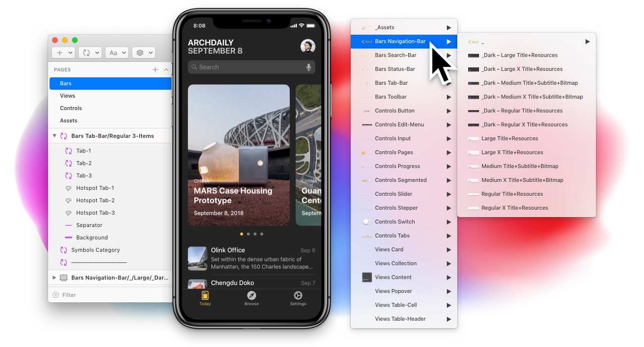
A starting point for iOS app design
For Sketch. Special prices for Education are available.
-
Sketch Prototyping Ready
-
iOS 12 Ready
-
Customizable Components
-
Dark and Light Schemes
-
iPad and iPhone Ready
Styles Across Documents
Text, Shared and Component styles are organized perfectly for reusing outside the library.
Library Extensions
We have already created Glyphs and Keyboards extensions, and more sections are coming.
Preview and Guidelines
A Preview file can be the single source of truth for designers, or be used as a guideline for developers.
Resizable Components
All components have constraints and have been tested for resizing, so there'll be no bugs when resizing them.
Set up your unique style
A flexible and simple framework structure allows you to set up the library in a few minutes, according to your project requirements. There are two pre-made themes – the Light one and the Dark one.

Meet the great symbols organization
Take advantage of our placeholders and columns layout grouped by symbol type. With this structure, you can work as efficiently and quickly as you want, while keeping the library in order.

Only usable Overrides
There are less instance symbols - now you have only the variations needed for an easy navigation in the Overrides panel, even with integrated prototyping hotspots in the components.

Components from HIG for all purposes

So there are updates?
We send email notifications and tweet when the new version is released. If you already bought any product just go to the Purchases page and download the latest version.
How to get a discount?
You can get a 50% discount on all product, if you are a student or a teacher, to enroll for an educational discount just email us any proof of your occupation.